Case Study on Typefaces
Typography Research & Selection for BETSOL Website Redesign
UI/UX Design Intern
Jun 2022 — Jul 2022
Web — BETSOL

BETSOL is a Data Management and Intelligent Automation company offering products and solutions to both enterprises and consumers.
Adaptability expands our capacity to handle change. Our aim was to select the best possible font through research so that it co-relates to BETSOL and provides better readability for its users.
The duration of the entire case study was 1 week, consisting of a team of 5 UI/UX Design Interns mentored by the Lead UX Designer, Karan Kowshik.
Typography describes the creative design of the text on web pages. It is the strategic arrangement of type to make written language legible, readable, and visually appealing. A typeface is the design of lettering that can include variations in size, weight, slope, width, and so on. Each of these variations of the typeface is a font. Typefaces reflect the personality of a brand and establish an information hierarchy. It can play a MAKE-or-BREAK role in grabbing the user's attention and in conveying the mood or feeling. This case study was done on the BETSOL website as a part of the redesign process to provide improved readability and user interface.
A typeface that caters to Betsol's customer base — investors, students and employees.
We started off by going through a bunch of websites to determine how they have implemented various typefaces and how that affects the website's appeal, readability etc.
We noted that most brands tend to stick with uniform typefaces or pair typefaces of the same foundry throughout.
Some of the websites we considered are showcased below:
1) Dropbox — cloud storage service that lets you save files online and sync them to your devices.
Home Page

Typefaces used are Atlas Grotesk, Sharp Grotesk
Blog Page

Typefaces used are Lato and Sharp Grotesk
2) MailChimp — marketing and automation platform designed and developed for businesses using email to reach out to their target markets.
Home Page

Typefaces used are Graphik, Means Web
Blog Page

Typefaces used are Graphik, Means Web
3) Code42 — cybersecurity software solution for Windows, Mac, and Linux that automatically backs up computer data to the cloud.
Home Page

Typeface used is Proxima Nova
Blog Page

Typeface used is Proxima Nova
Key Findings — 50+ Websites Analyzed
Most brands prefer using the same set of typefaces throughout their website.
The overall trend is to not go overboard with fonts — using a uniform typeface for the content and only ever experimenting with the headings and maybe, just maybe, the navigation bar.
Rather, what is observed is to make every section of the website stand out by itself, and target it towards its audience by making choices w.r.t imagery, colour blocks and animations.
Based on our research, we're aimed at modifying BETSOL's website w.r.t typography by implementing our findings. We decided on using a single typeface throughout the website.
Since we decided to not go with more than one typeface, we had to choose a font that would fit best with the entire BETSOL website. Statistics show that there are basically two categories of users that visit our website — a group of users who usually visit the website for information regarding jobs, internships and a group of people who visit the page looking for investing or partnering with the company. Hence choosing the right font that would capture these target audiences was our main goal. We decided to look for sans serif fonts that would make the content very easily readable and legible.
A few fonts that we selected were:
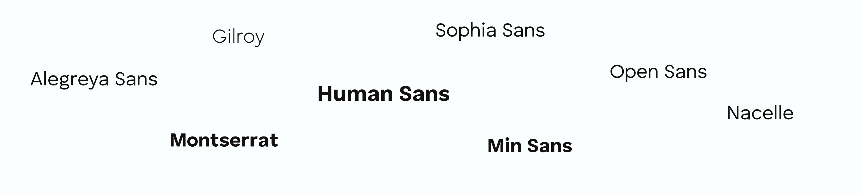
During the initial phase, we replicated one of the pages of Betsol's website using the fonts mentioned above. We received feedback on these chosen fonts from a few users, but no font received a clear majority. Since the first round's results were inconclusive, we followed Hick's Law which states "The more choices you present your users with, the longer it will take them to reach a decision." Hence, we narrowed the font options down to three fonts based on their readability, elegance, and legibility. The remaining fonts were turned down because the letter spacing was too close or the content appeared very cluttered or bold.
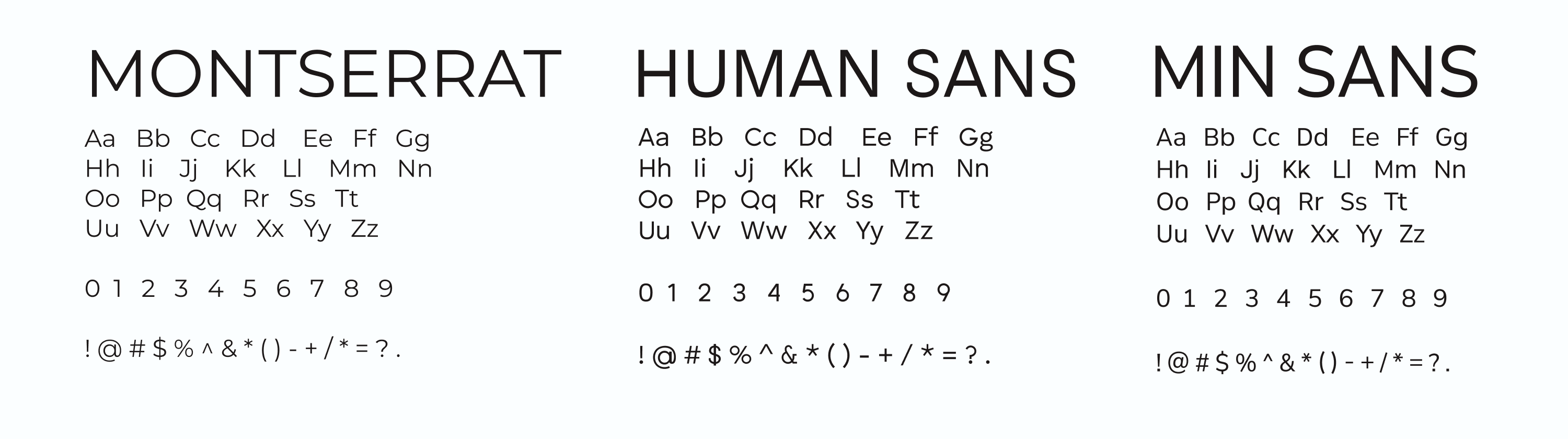
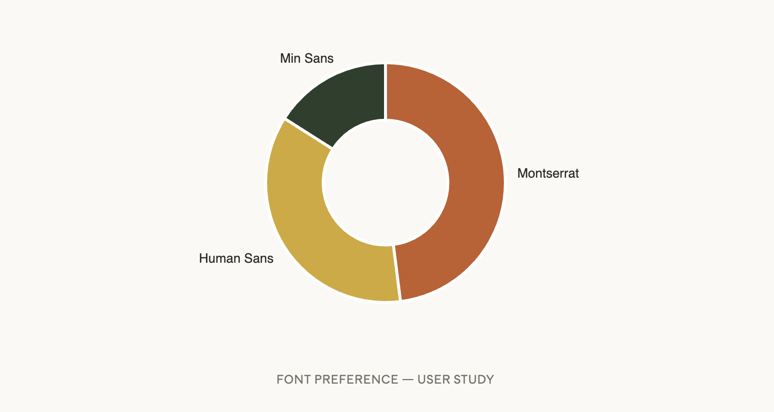
In the final phase, we tested the final fonts on a larger set of users (n=10). We presented the chosen fonts to the users and we observed that there was a divide between Montserrat and Human Sans, with most of them choosing Montserrat. However from a design perspective, we decided to go with Human Sans because the team felt that using Human Sans would make the website more readable, elegant, and legible.
Human Sans is a minimal and neat sans-serif font family originally designed in 2016 as a house font for Continuum, a design and innovation firm based in Boston, MA. The font family contains 7 weights from Thin to Black with corresponding Obliques.
Here's a sample implementation:
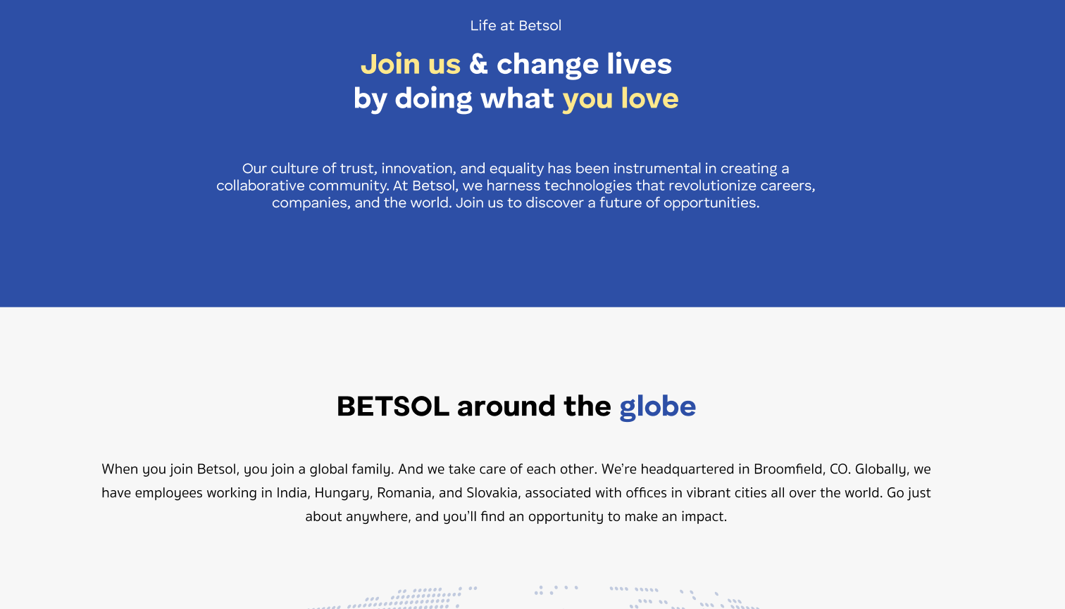
BETSOL's Old Careers Page
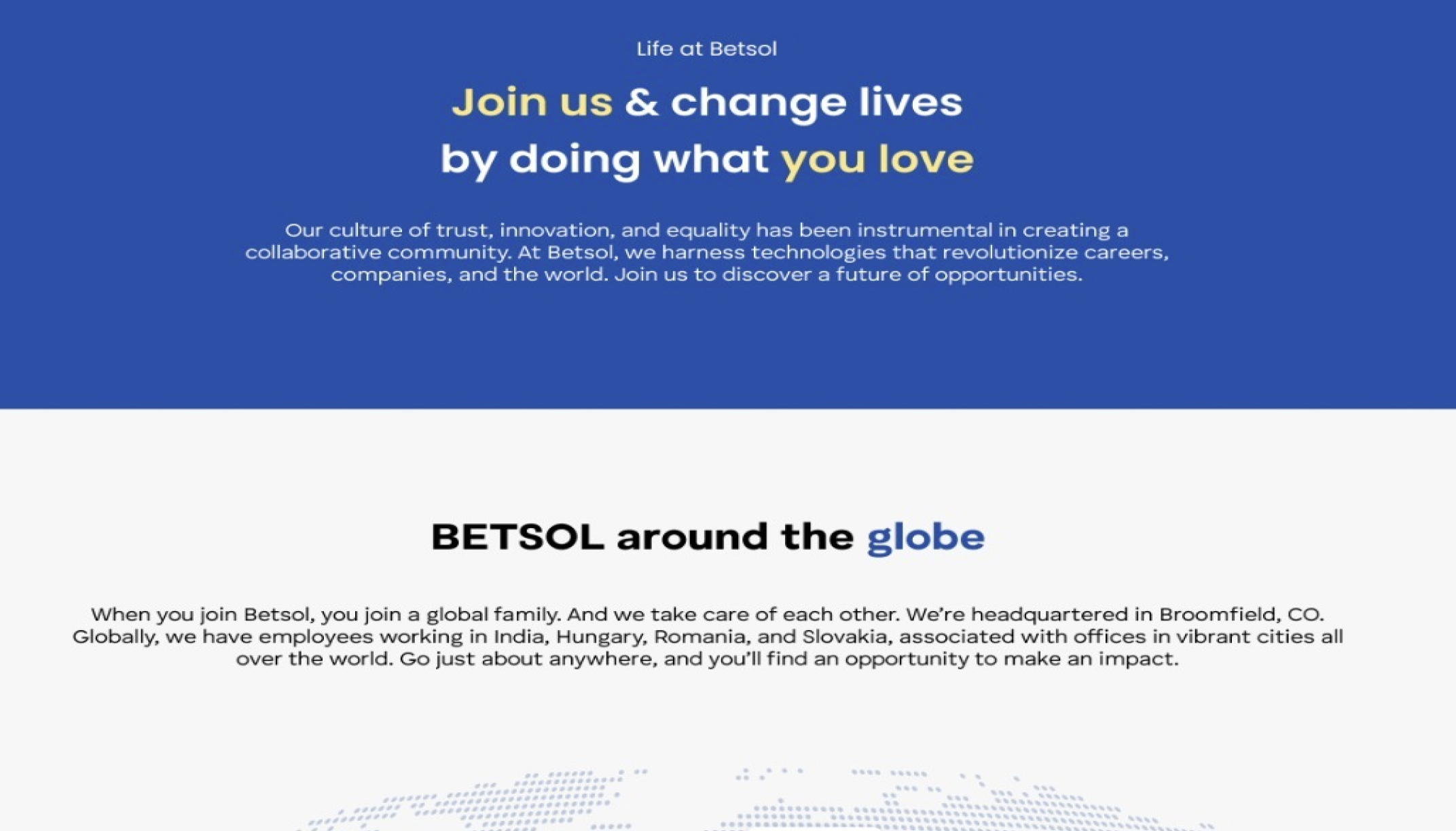
BETSOL's Current Careers Page